Marfields Group
High-end Developer
Brand Platform
Rebranding for the Leading Developer in Cyprus
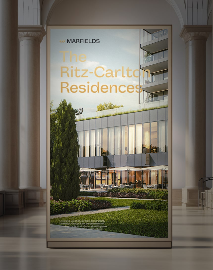
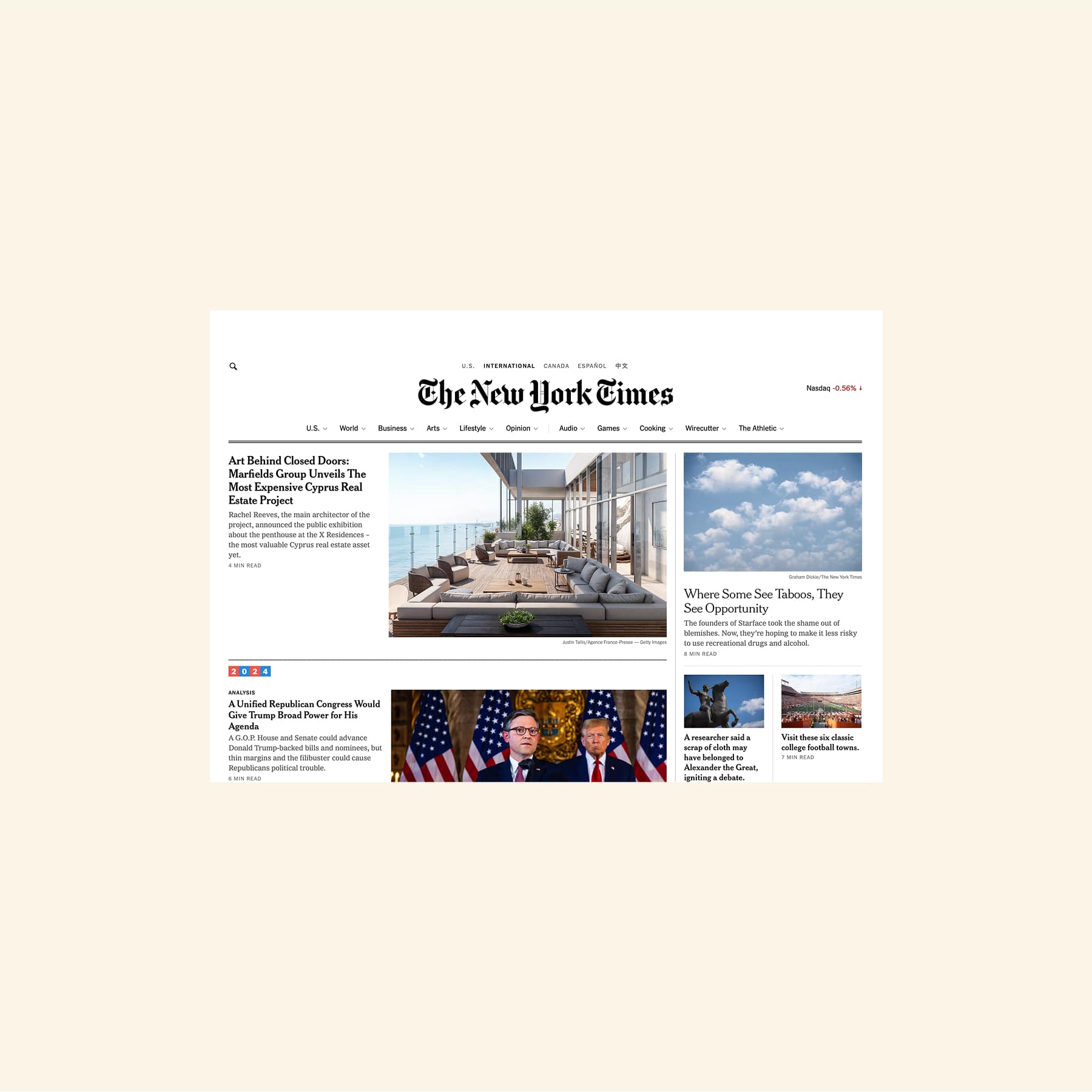
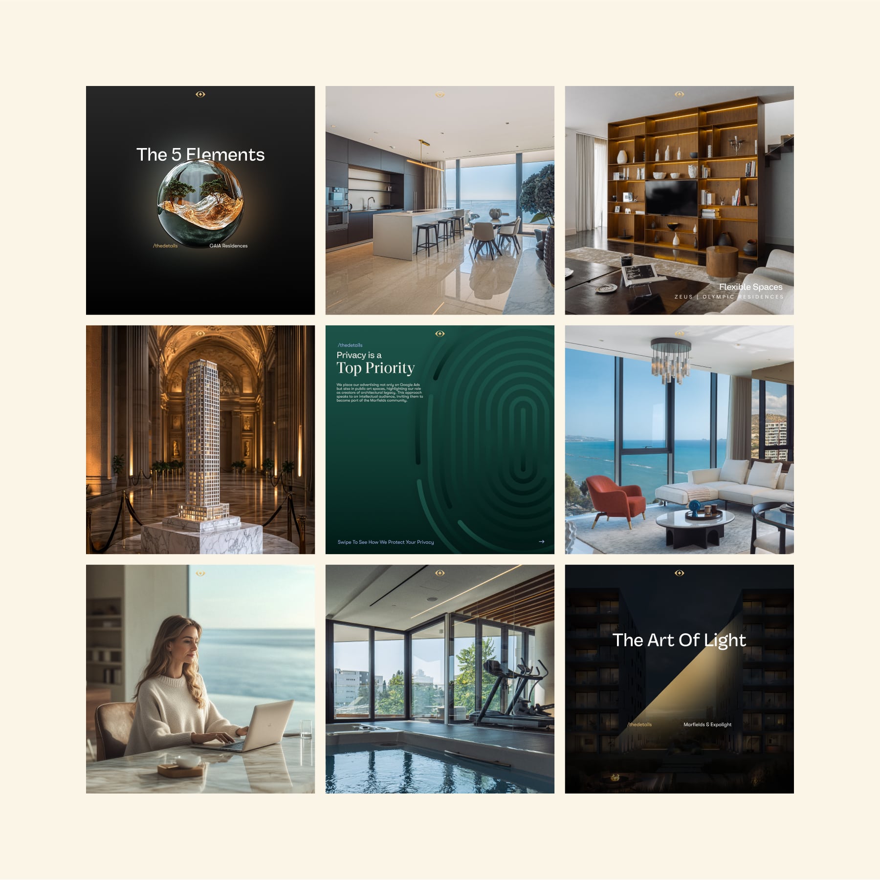
This shift is evident in the tone of voice, emphasising timeless design and artistic vision rather than just premium real estate. Social media now integrates conceptual storytelling, rather than just showcasing properties.
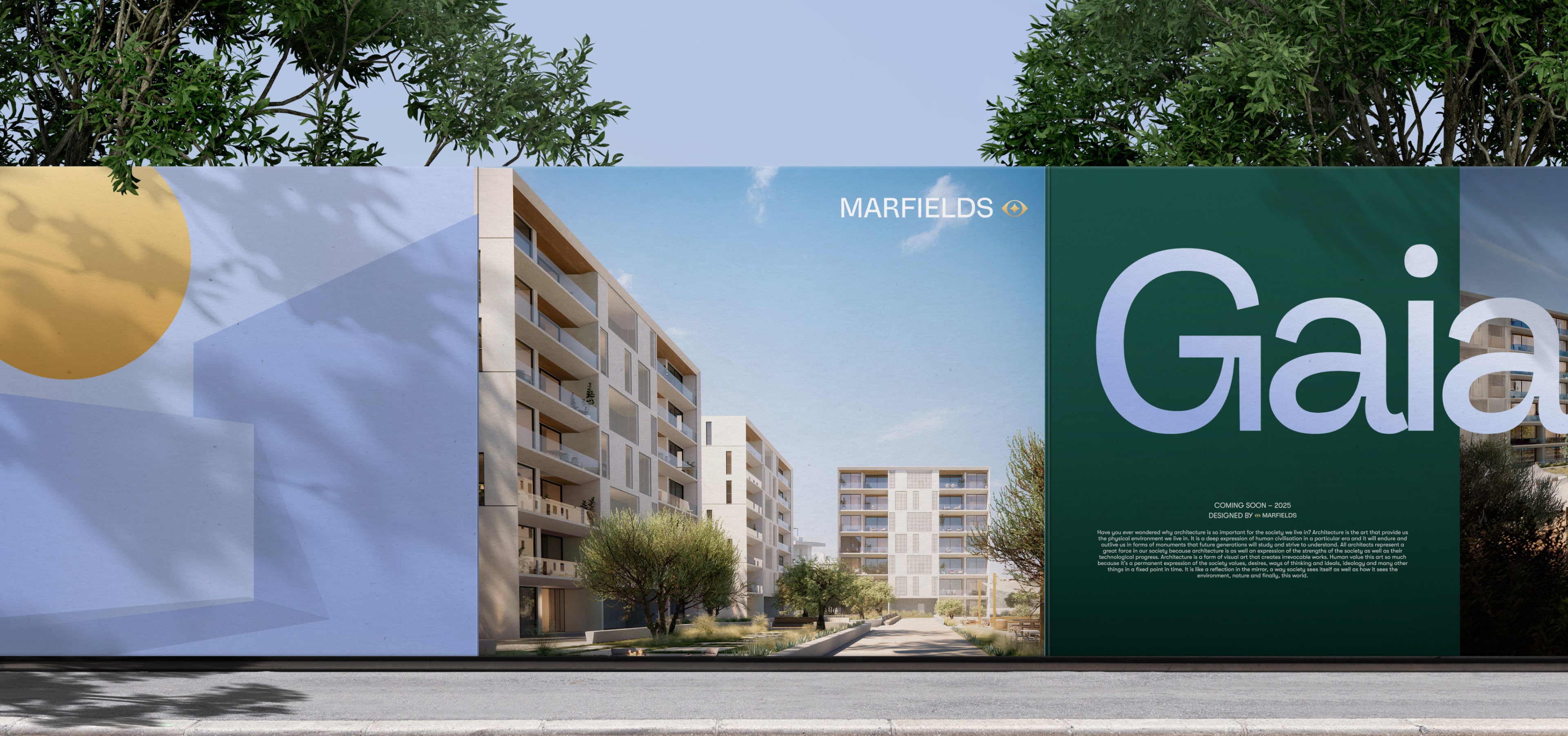
Our rebranding journey began with a search for entirely new meanings that could represent Marfields philosophy. The new positioning presents its as a creator & a curator of architectural masterpieces.
Our rebranding journey began with a search for entirely new meanings that could represent Marfields philosophy. The new positioning presents its as a creator & a curator of architectural masterpieces.
This shift is evident in the tone of voice, emphasising timeless design and artistic vision rather than just premium real estate. Social media now integrates conceptual storytelling, rather than just showcasing properties.
OUR MAIN
(
strategy, Branding, smm&target, marketing
)
IDEA
(
strategy, Branding, smm&target, marketing
)
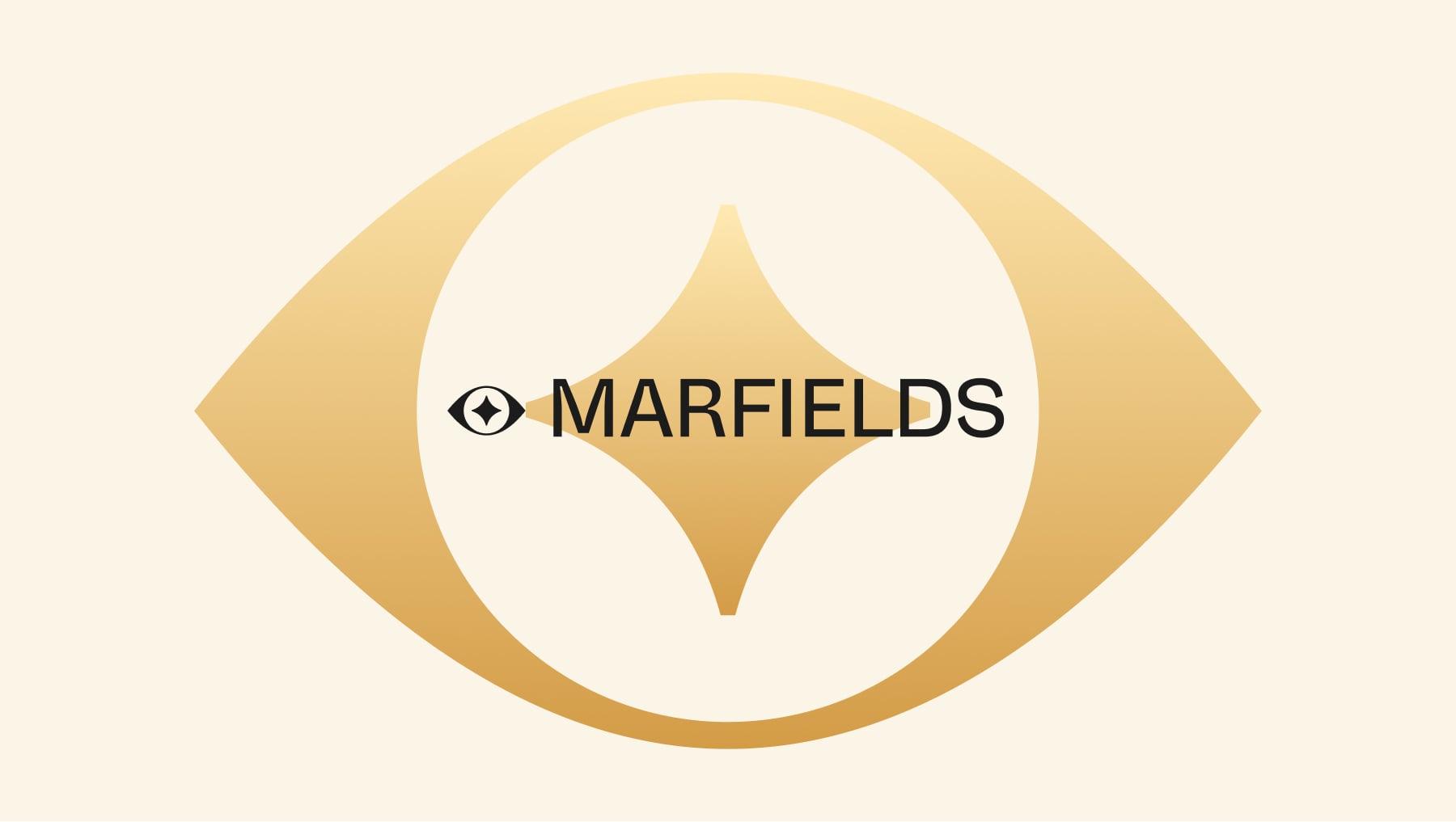
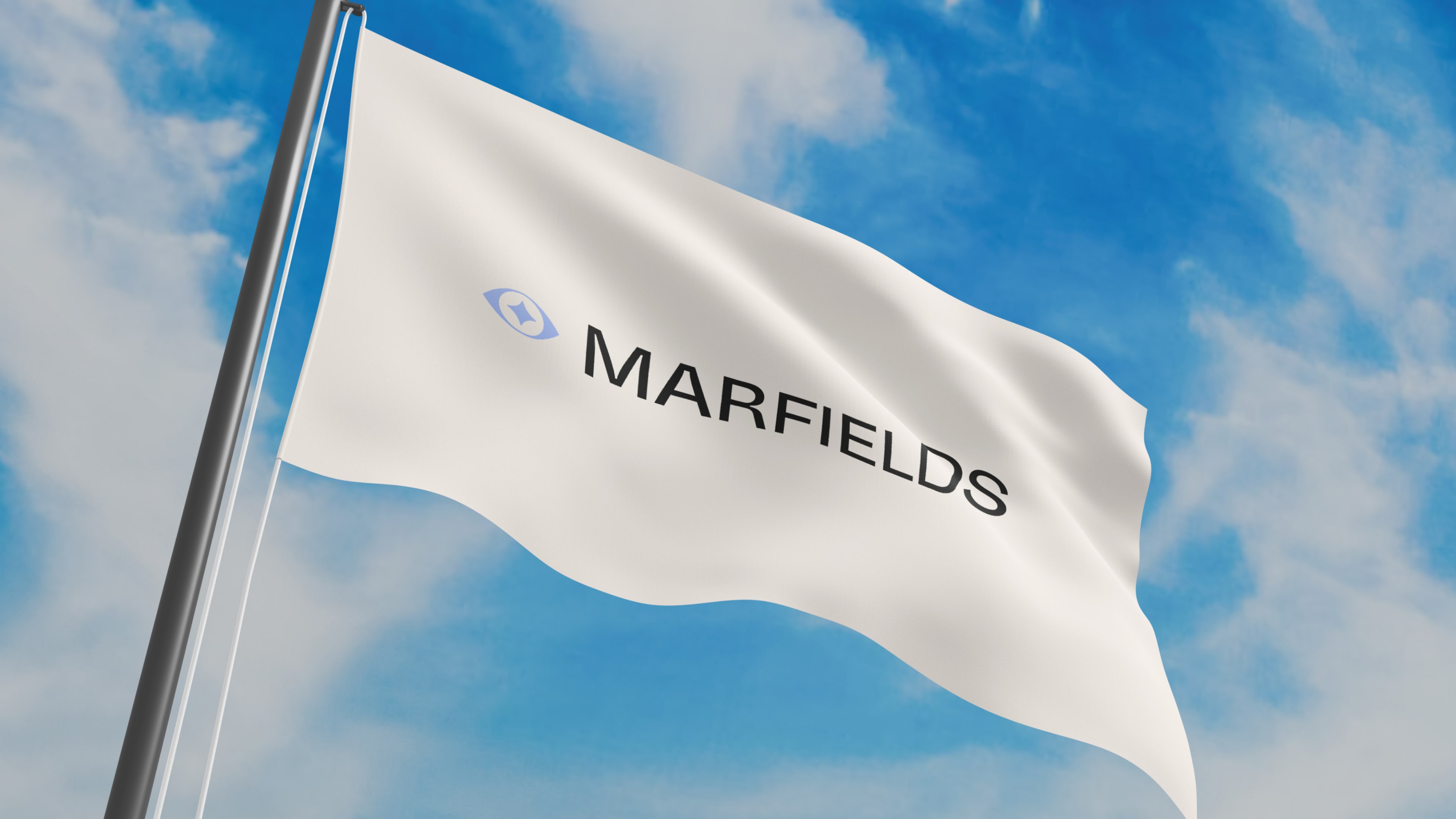
The Marfields logotype strikes a precise balance between structure and fluidity. At its core lies a defining element: an abstract mark that embodies perception, artistry, and leadership. Its intentional ambiguity allows for multiple interpretations, whether as a monogram, a dynamic structure, or an architectural motif.
Lilac-Blue – Inspired by Cyprus's evening skies, a colour during a twighligh. Emerald – Represents the richness of nature and luxury. Golden – Embodies warmth and prestige, moving away from metallic coldness to a more organic elegance. Graphite & White – A neutral base to frame and highlight architectural beauty.
Unique
(
strategy, Branding, smm&target, marketing
)
Concept
(
strategy, Branding, smm&target, marketing
)
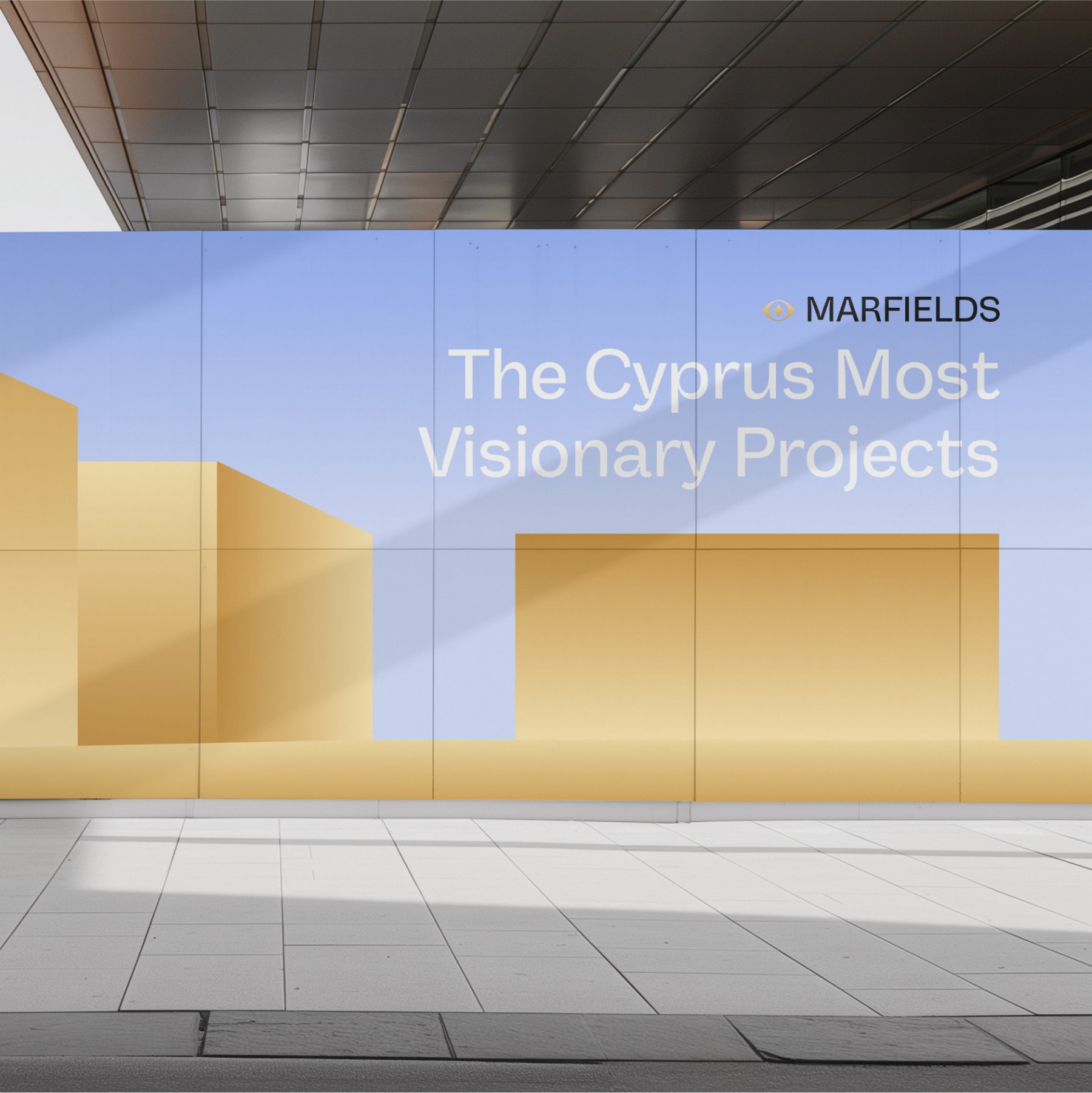
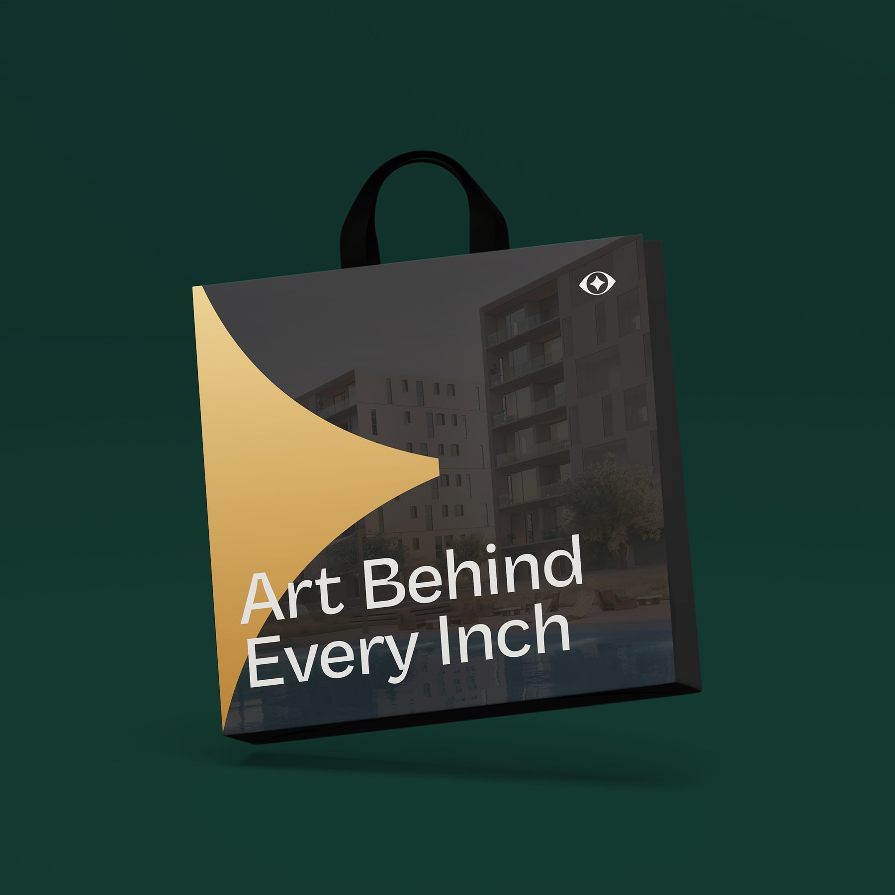
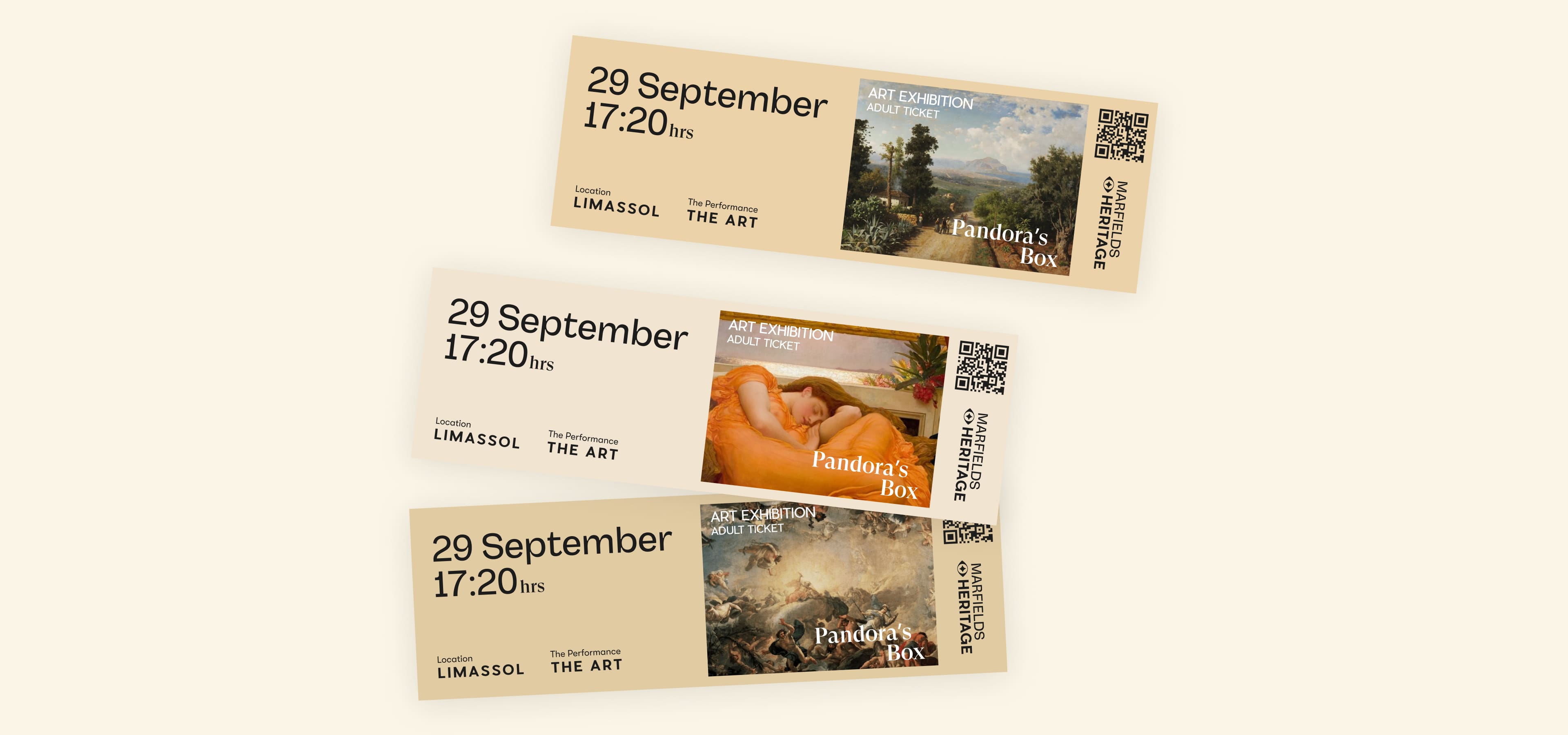
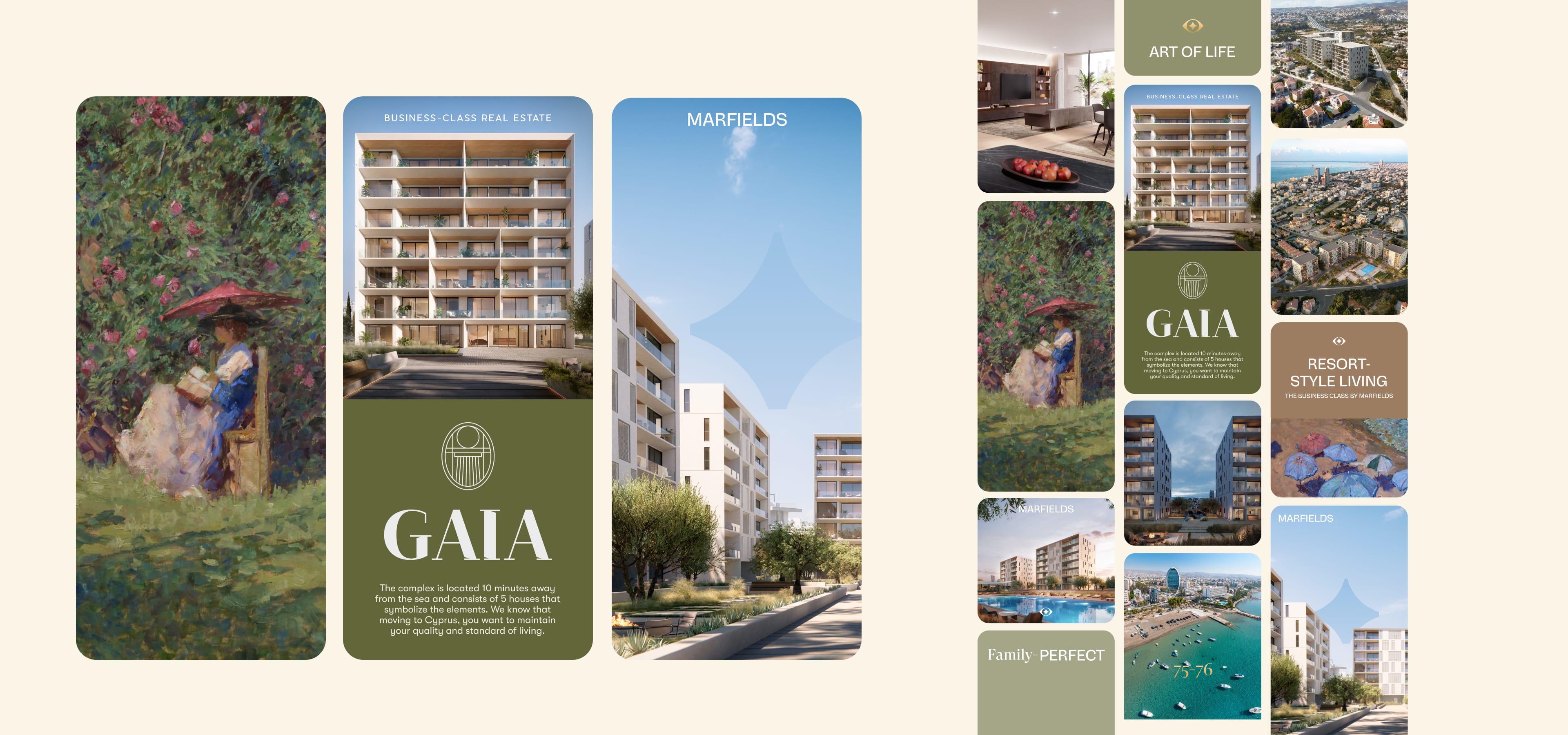
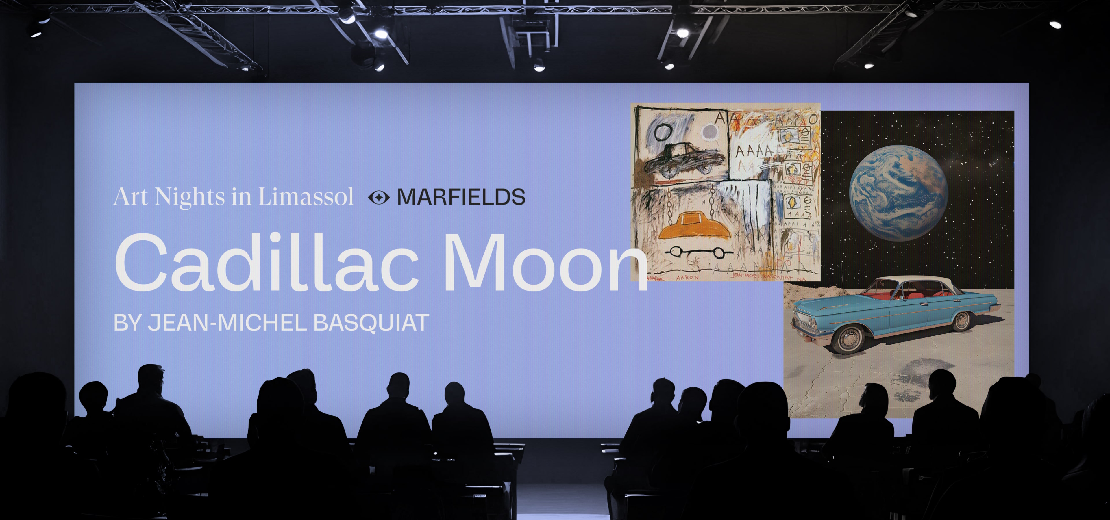
Illustration plays a vital role in the Marfields identity, connecting eternal art and modern architecture.
Our approach is a balance of minimalism and expression. We use clean geometric forms, abstract compositions, and a new colours to create brand paintings which can be both: ads & decor elements.
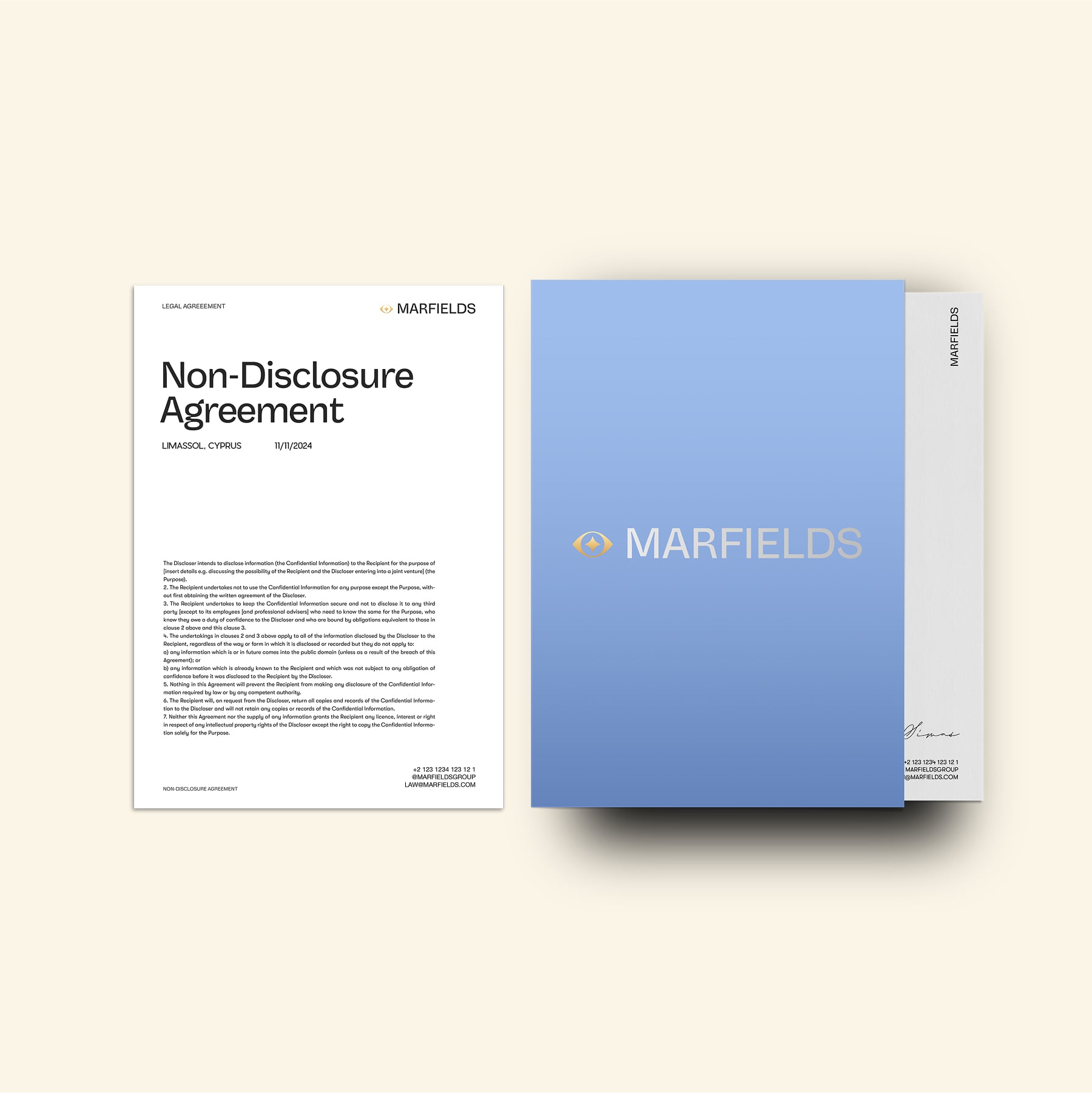
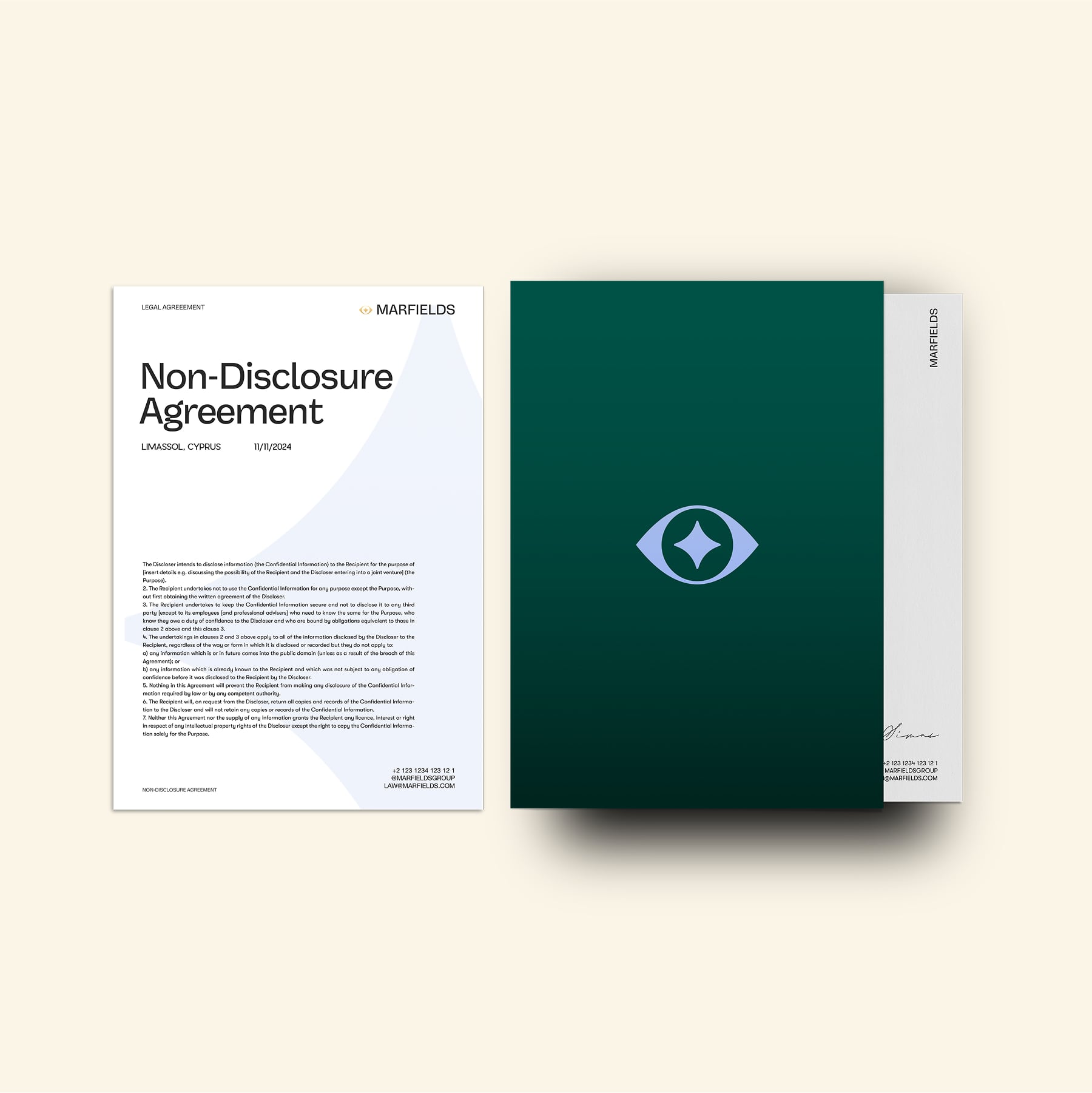
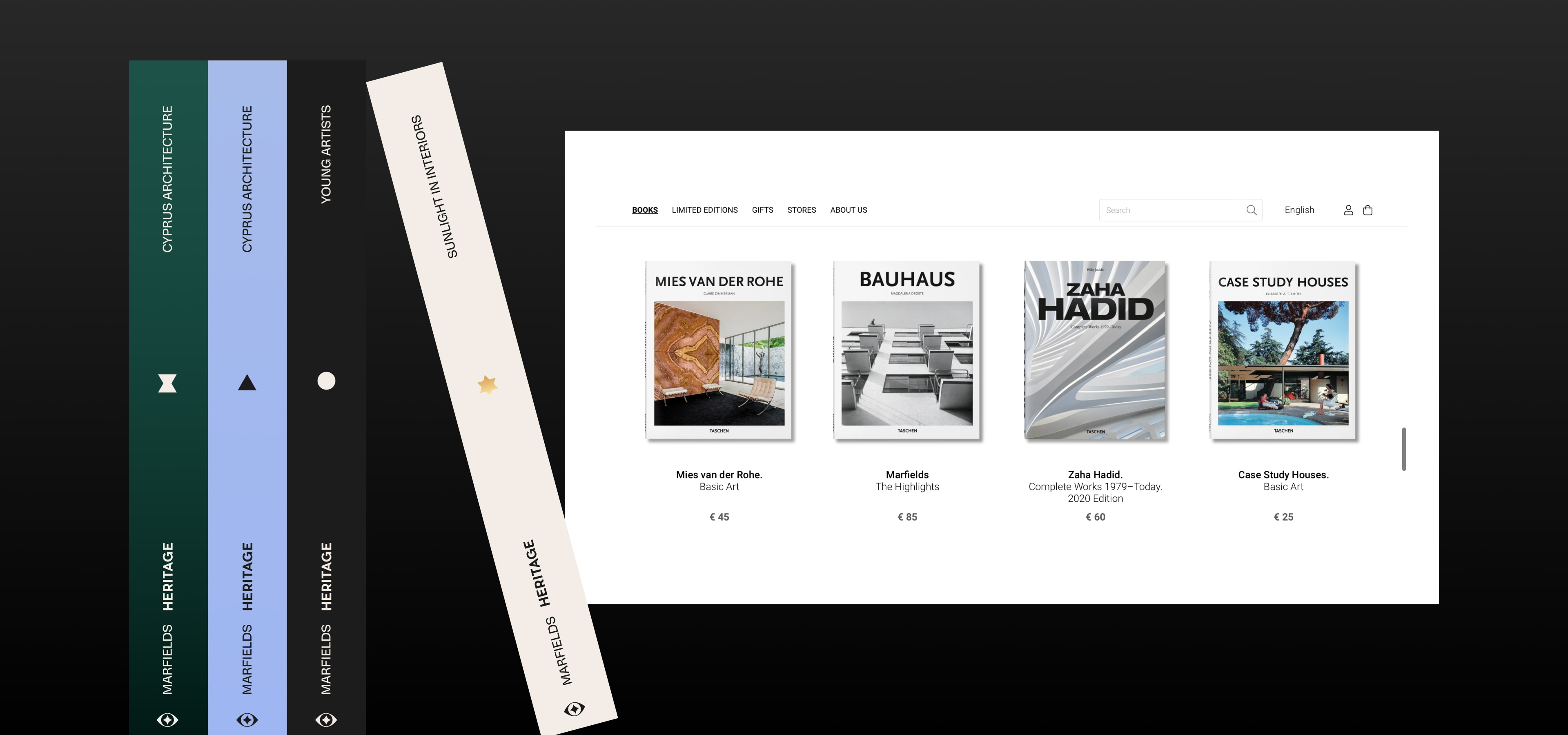
The fonts balance classic elegance with modern clarity:
GT Super Display – Inspired by calligraphic and expressive serif fonts. Vastago Grotesk – A modern grotesk sans-serif that ensures readability and precision. Pier Sans & GT Walsheim Pro – Bringing a mix of structured yet dynamic typographic contrast.
This massive rebranding is a bold and visionary move, elevating it beyond the conventional luxury real estate market.
This massive rebranding is a bold and visionary move, elevating it beyond the conventional luxury real estate market.