
EON
Technology-led development
Marketing Strategy & Brand Identity
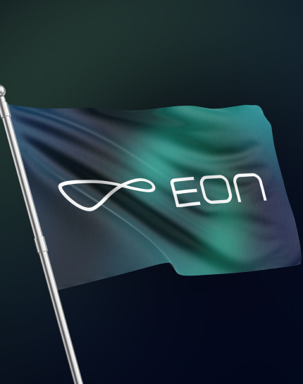
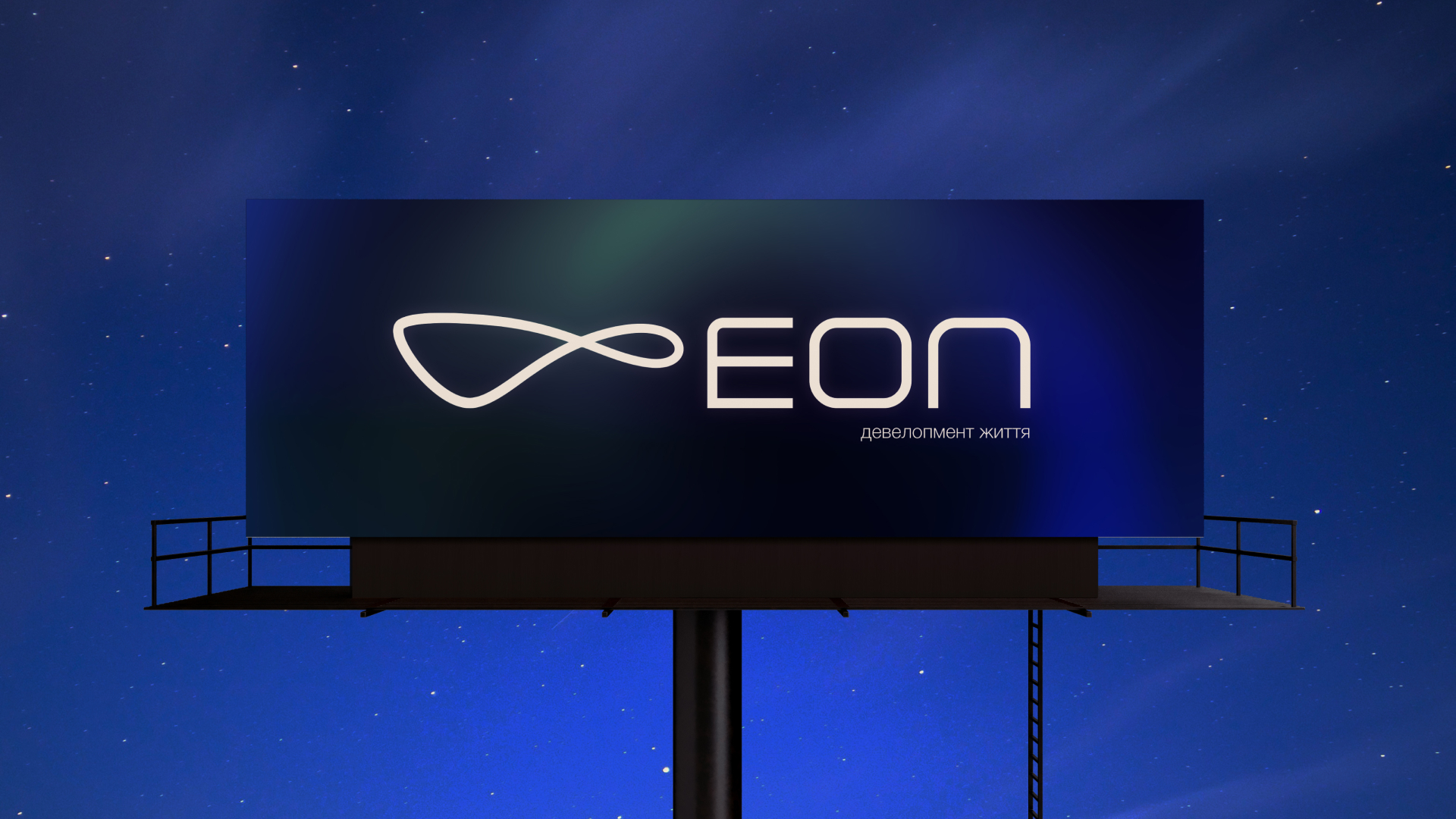
The Shape of an Aeon
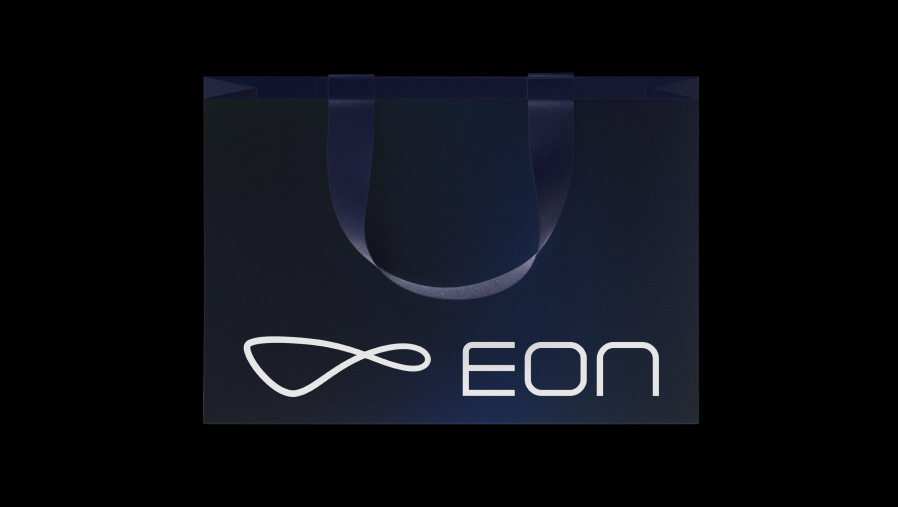
As a progressive company, EON needed an identity that would break away from traditional industry aesthetics. Rather than relying on familiar cues, we created a clean, technology-led visual language that communicates innovation and a forward-thinking approach.
Derived from the Greek term aion, meaning an age or an immeasurably long span of time, the name EON represents a vision that extends beyond the present. It reflects a company driven by progress, innovation and the ambition to shape the future.
Derived from the Greek term aion, meaning an age or an immeasurably long span of time, the name EON represents a vision that extends beyond the present. It reflects a company driven by progress, innovation and the ambition to shape the future.
As a progressive company, EON needed an identity that would break away from traditional industry aesthetics. Rather than relying on familiar cues, we created a clean, technology-led visual language that communicates innovation and a forward-thinking approach.
our
(
strategy, Branding, smm&target, marketing
)
vision
(
strategy, Branding, smm&target, marketing
)
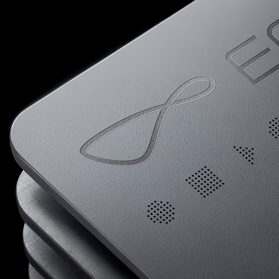
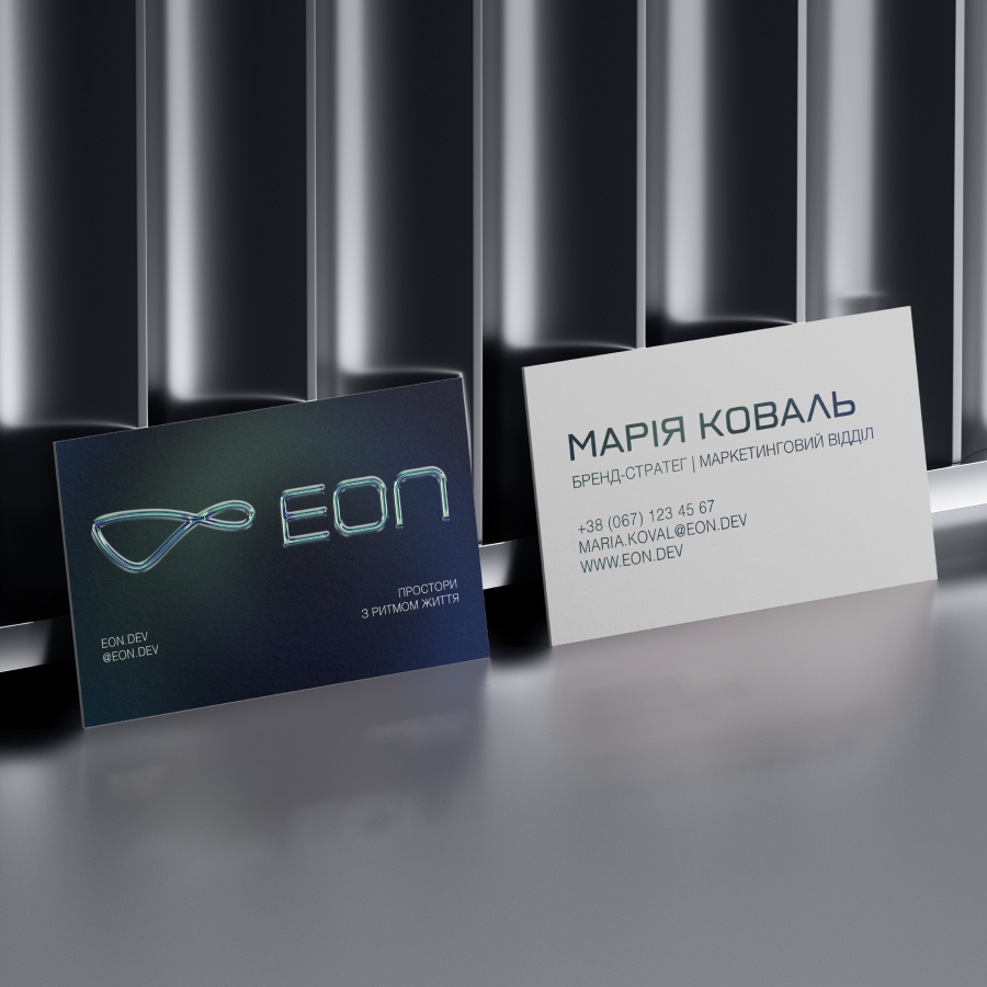
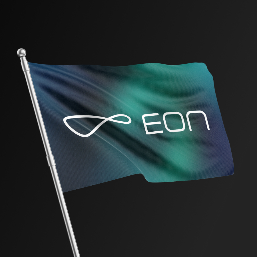
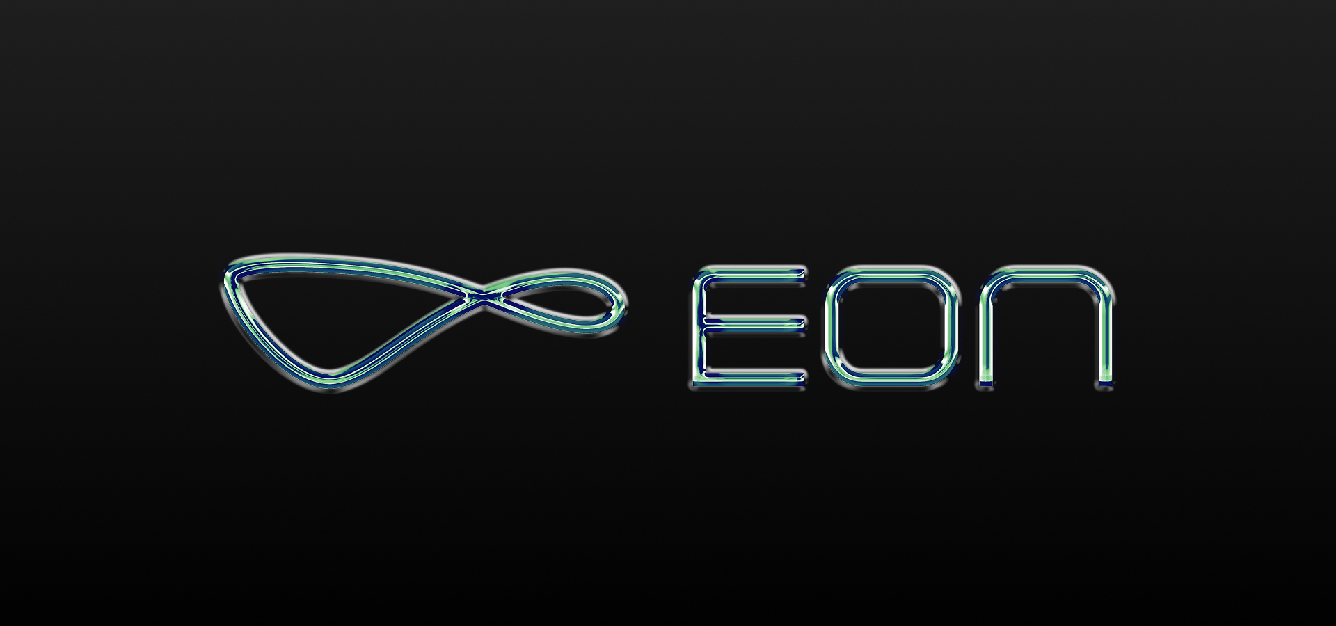
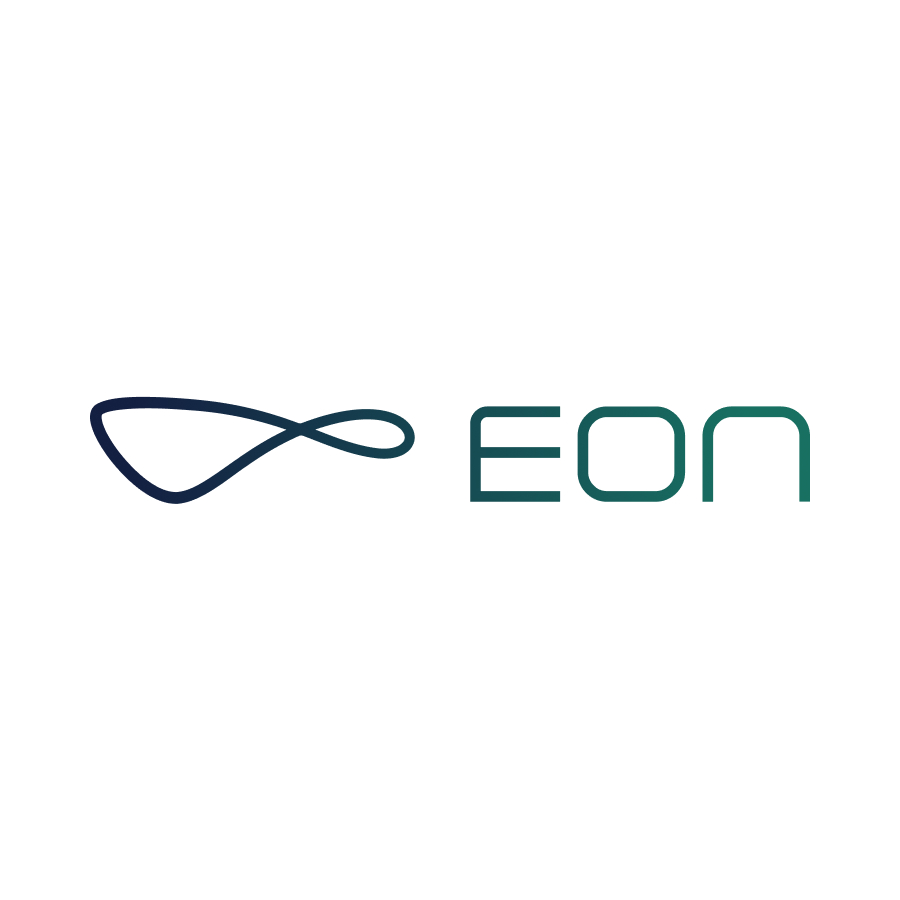
The symbol is built around the idea of an uninterrupted flow of time — a visual expression of continuous evolution and forward momentum. Inspired by the meaning of EON, it represents a company that is constantly growing, adapting and shaping the future through long-term vision and strategic investment.
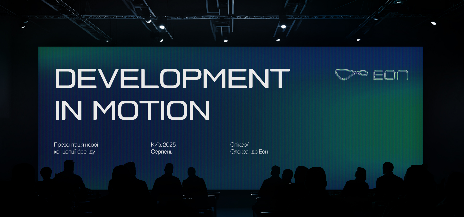
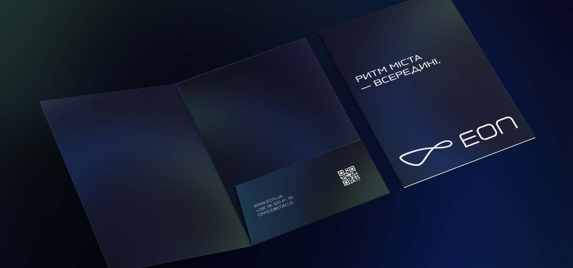
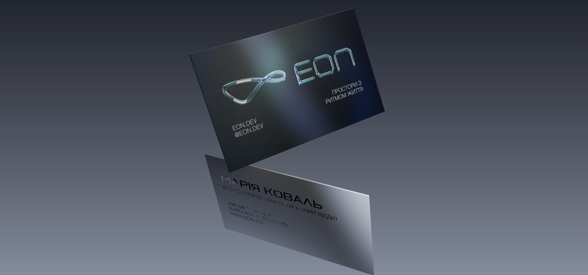
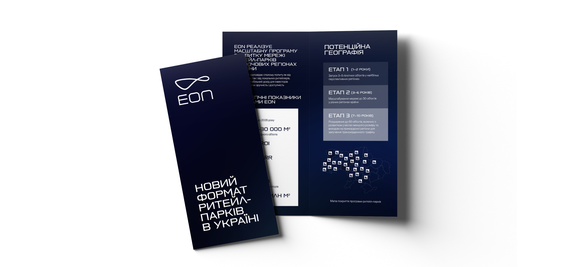
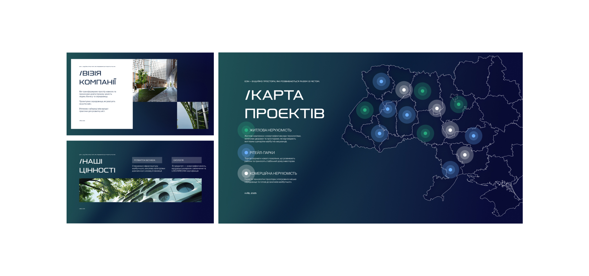
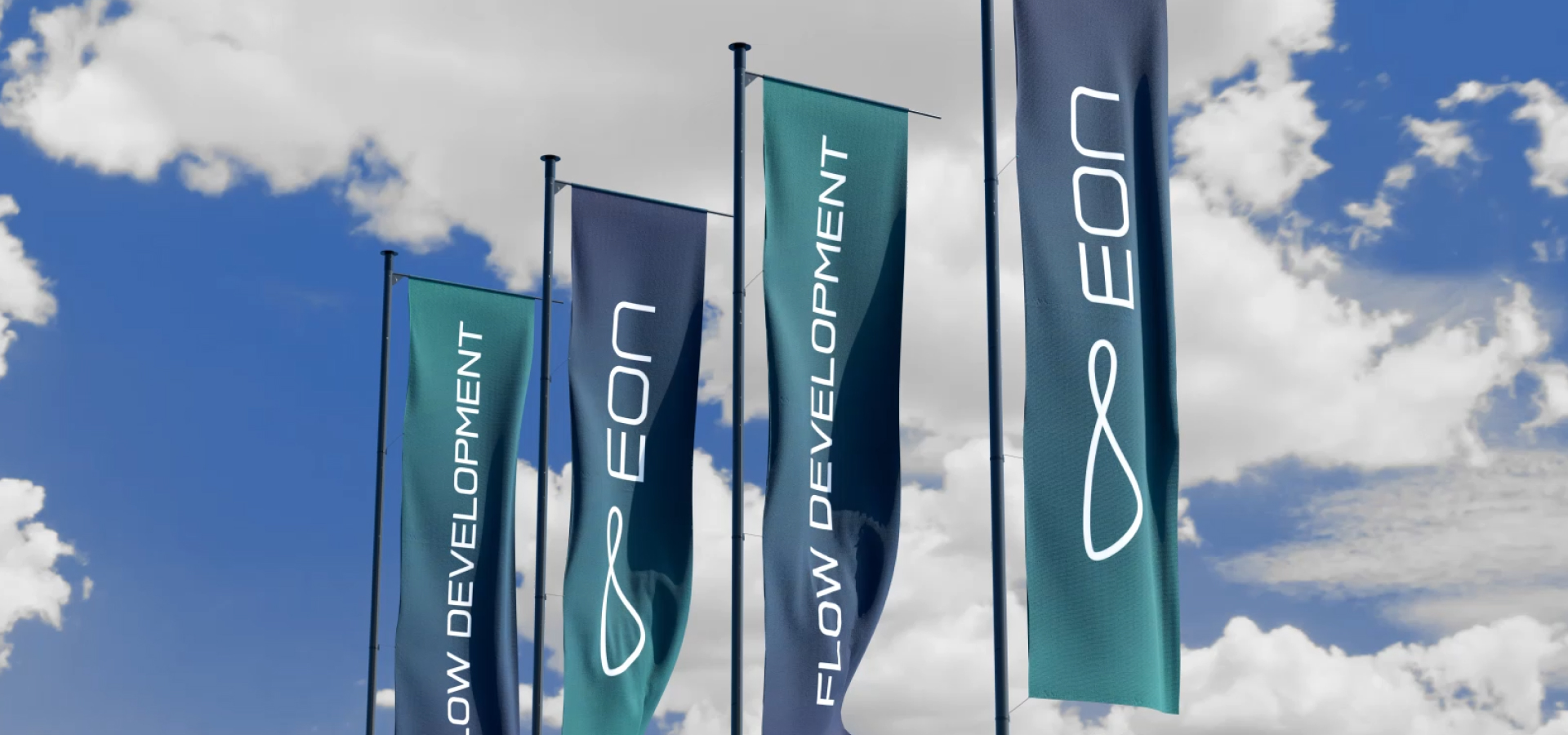
A vibrant navy blue-to-dark green gradient introduces a distinctly technological character, moving away from the visual clichés of the real estate sector. Combined with clean typography and a contemporary visual system, the identity positions EON as a progressive developer driven by innovation, digital thinking and modern investment solutions.
A Flexible & Bold Identity System
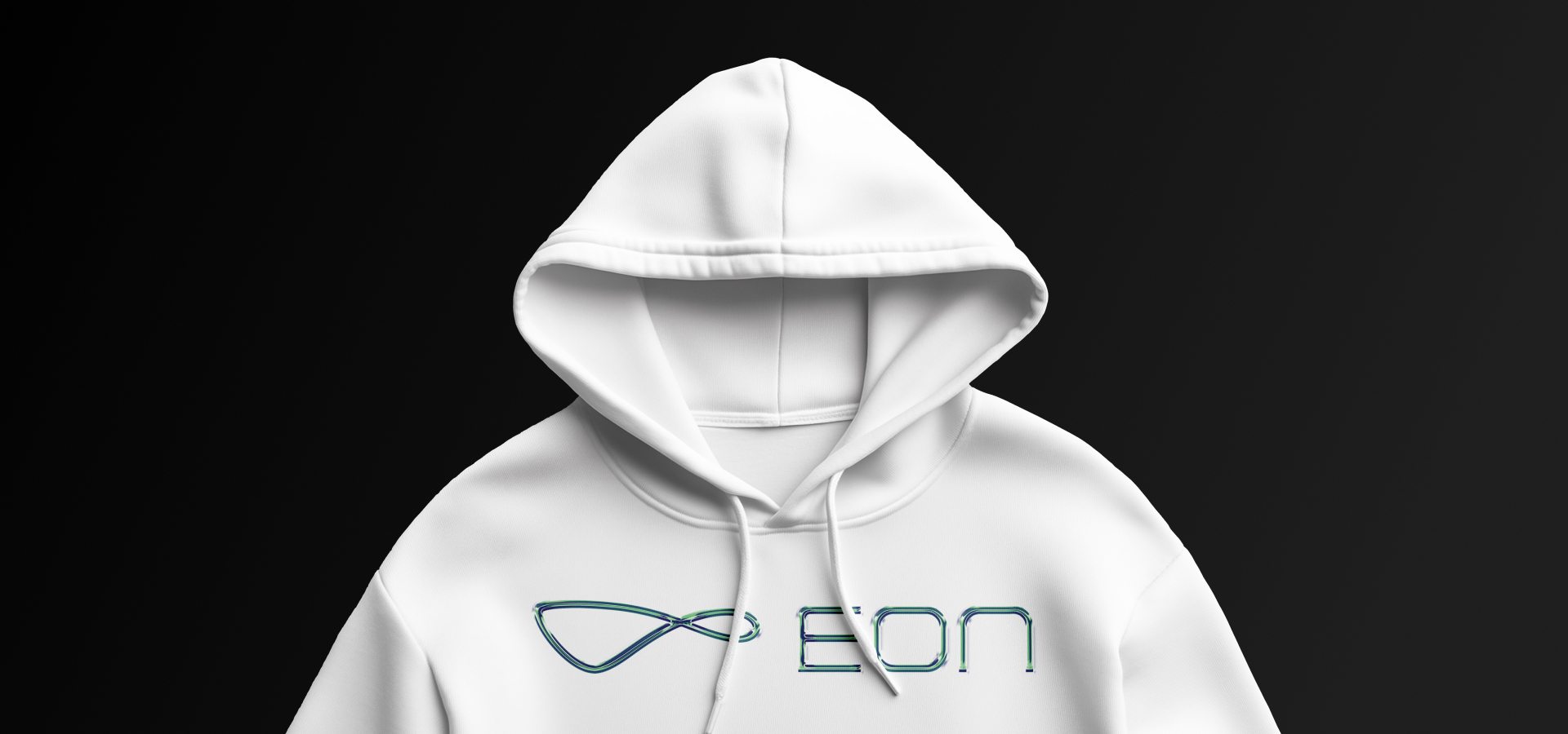
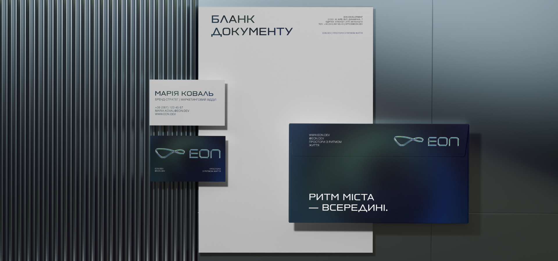
The identity extends beyond the logo into a flexible visual language that brings consistency to every brand expression. Graphic elements, typography and colour work together to create a system that is instantly recognisable while remaining adaptable across different contexts.
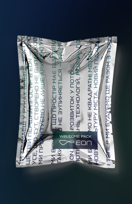
By combining strategic restraint with distinctive visual cues, the identity gives EON a clear and confident presence. It strengthens recognition, supports premium positioning and provides a scalable foundation for the brand's growth.
By combining strategic restraint with distinctive visual cues, the identity gives EON a clear and confident presence. It strengthens recognition, supports premium positioning and provides a scalable foundation for the brand's growth.